Showing posts with label tutorial. Show all posts

Monday, March 10, 2014

Digital Coloring Part 2

By: Silent J

Greetings grasshoppers, the journey continues. Hopefully you’ve read the first part and have your line art separated from the background. If you don't know what I’m talking about, scroll back to the first part. Now, let’s get to work.

Step four: Making flats

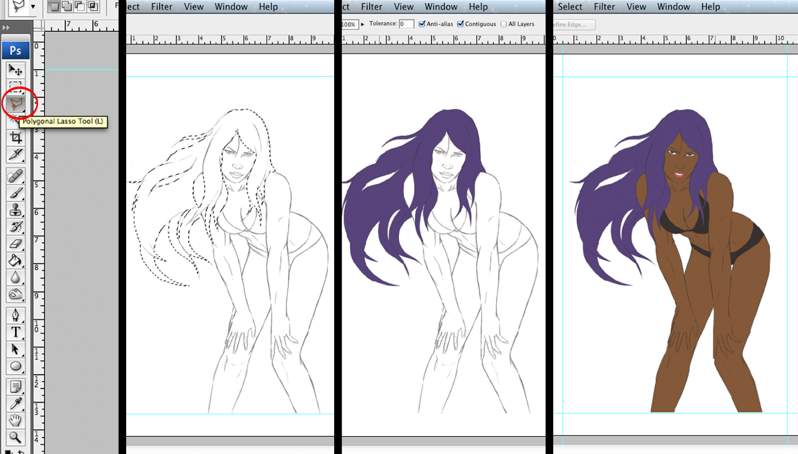
  Below the line art layer, make a new layer and call it "flats". In this layer you will select areas of your art and fill it with a solid color. For me the best way to select the areas is using the polygonal lasso tool. I like using medium-dark colors when filling up areas I like. If done right, your work should look something like this. Don't fill the background on this layer; keep it in another layer below

Step five: Tones

   Duplicate the flats and line art layers. Merge down the line art copy layer to the flats copy layer and name it "tones" (right click or control + click on top of the layer to use merge down option). The reason we're merging these two layers is because we're going to blend everything in this layer. Make sure to turn invisible the original line art layer.

   Now, we’re going to work on the light tones, but for that we first need to establish where the light is going to come from. In my case I decide to make it come from the top right .

 Click on the flats layer and using the magic wand tool select the area you want. I chose the face. Go back to the tones layer and select a light tone of the flat color of the area you chose. Select the brush tool and choose the type of stroke you want. I suggest the airbrush soft.

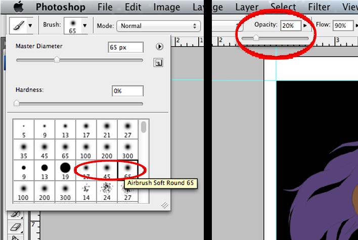
After that there's an option that says opacity, click it and take it down to 20%. Now the brush strokes that you do on the art won't be solid colors. The more you use the brush in the same area the more color you will put. If you don't understand that last part, just make a new file and go crazy experimenting with the brush and lowering the opacity. You will get it then.


 You're ready. Now, you have to brush the areas where the light reflects. If you put too much light, select the original flat color and use the brush until you’re satisfied with the result. At this point you can also use the blur tool to blend all the tones better.


 It’s important– like I said before– the line art blends with the color, so make sure to paint darker over important line details like eyebrows and eyelashes.

 After the light tones, we’ll begin with the shadows. Select a darker flat tone, but not too black. Just like light tones do the same with the shadows. This time you’ll work on the opposite side and don't forget to use the blur tool.

Just rinse and repeat in all the other areas.

Step Six: Final details

 Almost done! The white areas of the eyes and teeth don't look good if you leave them flat. Give them some shadow using the light tone of the skin. You can make a light reflection effect on the eye by raising the opacity to 100% and by clicking on the pupil with white. 


 Instead of leaving the hair looking like a weird, solid wig we can make the illusion of strands of hairs by using the brush in a smaller size. Make strokes with different hair tones and have some of those come out of the hair root area.


 To make it look a little more interesting use a secondary light source. Where the secondary light comes from is up to you, but to keep it simple make it opposite of the primary light, in my case the bottom left. In the shadow areas use any light color that you want to make the secondary light effect.

  It’s not necessary, but for the heck of it I gave the entire figure an outer glow effect. If you want to do that select all the flats areas and on a new layer fill them whith any color. Go to fx > outer glow and on the window choose the color, the size, and spread you want of the glow. Make sure to keep this layer below the tones layer. 


   We are done! I know it was a long one, but I hope you got some knowledge out of it. Any questions or suggestions you can email me at geekwhale@gmail.com. Until next time! Even if you can't feel your hands don’t stop, keep drawing!

Monday, March 3, 2014

How to Start Writing and Improving it, Part 1 of 3


By. D.Fernandez 

Have you ever found a new thing in fiction and just latched on like a virus looking for warmth? I hope the movie Pacific Rim came to mind when you read that. The movie blew your mind, and you walked out picturing whole alternate universes of other fiction favorites, only now with giant robots. Drawing might be a little out of your reach, probably being limited to careful and squiggly stick figures. My stick figures are works of art, if you ask me. It’s hard to convey meaning with them, and stick figure robots don’t look too epic.


Hey don’t despair, anyone can write, you figure. Why, that’s what your totally legitimate copy of Microsoft Word is for! Assuming you don’t have a computer, there's those things, p-paper and, uh, pencil? I’m not sure what those are anymore, but I’m told they can be used for writing. So you set off to give life to your Sherlock fan-fiction set in the Pacific Rim world, but nothing seems to be gluing together. You re-read a paragraph and knowing you can go back an edit it, it just doesn’t seem to come to life.


This is a three-part column, dedicated to giving you budding writers a solid ground with which to start with.  Practicing can improve your style, but just think of all those dramatic and slightly sexual scenes between Holmes and Watson you’ll be able to write soon (while they pilot a Jaeger no less). For this part, we’ll focus on description and your new best friend, a Thesaurus. Take this following example to start with:


            “I’m not sure what to do with my life anymore,” Raleigh said to Mako Mori, feeling confused. He felt distraught at the thought of never piloting a giant robot again.


No, that doesn’t read very badly at all. There’s nothing inherently wrong with it either, or else your eyes would be bleeding. It’s lacking though, isn’t it? How can we turn that into something with a bit more glitter and shine? Read this example:


“I’m not sure what to do with my life anymore,” Raleigh said to Mako Mori. Somehow, with the kaiju gone now, it felt like his life had no purpose or direction anymore. This wasn’t how it was supposed to be at all, not with his whole life ahead of him. Instead of celebrating, he found himself questioning his own existence. How could it be so tightly wound to a giant war robot?


Besides being longer, the difference between the first example and the second one is a pillar of creative writing– telling versus showing. Let’s say:


            Marshall hit the jackpot and won a shiny-new, red sports car. He called his friend Ted, “I won a new red car!”  Telling his best friend isn’t going to cut it. O.K., now let’s take a look at this version below:


 Marshall hit the jackpot and won a new, sports car. He sped down the highway, out the exit, in-and-out a few roads. Then screeches to a halt in front of his friend’s house. Ted, his friend, looked out the window and gawked at Monty, who waved back at him. He went out and both stroked the shiny paint of the crimson car.  That has more impact than just calling and telling them the car is red.


When you write, you have to constantly strive to achieve that same effect of showing with words. In the first example, the reader is told that Raleigh is confused and distraught. That’s not going to hook anyone though. By contrast, the second example weaves you through Raleigh’s thoughts and consciousness. Instead of just stating what he’s feeling, you describe the mess that’s in his head. This is much more compelling than simply stating facts, and is crucial to giving readers an idea of who the characters are.


Let’s take a look at this next example:


Sherlock suspected something was wrong. His deductions were nearly always right, after all. Watson also suspected the same thing; though he lacked Sherlock’s deduction skills, his suspicions could also prove to at least point Sherlock’s deductions in the right direction.


This is also fine at first glance, yet at second glance there’s something slightly nagging in the background. It’s like a woodpecker pecking in the same spot, over and over again at 10 AM on a Sunday morning, like the lazy good-for-nothings they are. While it’s true that language can only give so many synonyms for the same thing, cycling between the same two words will leave readers bored and wandering elsewhere. Here’s where your BFF the Thesaurus, and a little showing come to the rescue. Try this version:


Sherlock suspected something was wrong. After all, his skills in deduction were nearly unmatched, and he was hardly wrong, something he occasionally hated. Watson had similar misgivings himself. Though perhaps not as deft at making inferences as his companion, Watson’s uncertainty nearly always pointed Sherlock’s notions in the right direction, as well as providing invaluable information.


Now, instead of a woodpecker that won’t get a job, you have a paragraph that uses similar words for the same thing. Readers are less likely to get bored, and now you’re a respectable badger, with a full time job and a home.


As with anything though, take it all in baby steps. Practice a little each day, keep a journal (a Tumblr for you hip kids or whatever you’re using), recount everyday happenings, and make them into small snippets. Always revise! Just like that extra shot of rum, what seems like a good idea now might just become a pang of regret in a day or three.

Monday, February 24, 2014

Digital Coloring Part 1


By. Silent J
  Greetings grasshoppers. This tutorial is going to be a little long so I’ll divide it in two parts. This one will show you how to prepare your Photoshop file. It doesn’t sound very exiting, but it’s a very important step before you get to work. I hope you saved the drawing from the last tutorial, because you’ll be using it in these two tutorials. Things that you will need today:

1.      A computer (PC or Mac, your choice)
2.      A scanner
3.      And a Wacom tablet.

  There are different kinds of Wacom tablets you can use, each with different features and prices. If you can spare the change, the Cintiq is available for around $2,499. If your change consists more of pennies, you can get a Bamboo from about $85 to $100. (The link is a bit higher than that price range but it’s not difficult to scour eBay for a good deal.) If you’re out of pennies, then you can use a regular mouse but bear in mind that the same results won’t be the same.

4.      Oh, and Adobe Photoshop.
 
Step one: Scan your work

   
  Make sure to scan your art at a resolution of at least 300 dpi. I can’t really go to detail on how to scan cause all scanners are different, so you’ll have to play with it on your own to find out how it works.

Step two: Make a new file

  For those not too familiar with Photoshop, go to File>New. Next, put the size that you want. I personally use 11”x17”, the standard size for comic books. The resolution, as always, should be 300 dpi. If you're going to print it, the color mode should be CMYK, but, if you just want to keep it digital or to upload on a website like deviantArt, go for RGB.

 
  After that, place your art on the file by clicking File>Place and choose your art.


Once you’re done with that, place the art however you want. The art might not look dark enough, so to fix that, go to Image>Adjustments>Brightness/Contrast. There, play with the sliding bars until you make it as dark as you want.. If you need to clean up the art, use the brush tool with white.


Step Three: Separate line art from background

  It’s easier said than done. But first, merge down the line art layer with the background layer just to make sure that the art is the same size as the file. To merge the layers, right click (Control+click on PC, Command+click on Mac) on the art layer, and click the merge down option.


 Next, double click the background layer, and when the window appears press Okay to unlock it. The padlock icon on the layer disappears and the layer changes to "Layer 0".


  Next, go to Select>All, then Edit>Cut. Then go to the Channel window and make a new layer (the layer should look black). In this channel layer, click Edit>Paste to put the art.


  Here comes the tricky part though, because we want to select only the line art but it won't work by clicking Select. What you’ll have to do is put the cursor on top of the channel thumbnail (small square on the layer that looks like the art), then push and hold control (command on Mac). The cursor should change to a hand with a square on top . 


 Without letting go of control or command click the channel thumbnail. If done right you selected all the space around the line art. 


  With this selection, we then go back to the layer window and make a new layer. Go to Select>Inverse, then using the color black, go to Edit>Fill. When the window pops out click Okay, and you should have your line art background free. Make sure to fill layer 0 with white.


  Finally, be sure to save this file because in part 2 we get started with the fun part.

Tuesday, January 21, 2014

Pin-up Tutorial: Pencil Line Art

By Silent Jay

Greetings little grasshoppers. When I'm not working in the 10th circle of hell, (yes, there is a 10th circle, Dante missed that one), I like to spend my time drawing. Hopefully I'll be able to share some of my knowledge today. Like it says on the title, only pencil line art, we will work on shadows and colors another time.

First thing, materials, need the right tools for the job:
Materials 


   1. Bristol Paper = It comes in smooth and vellum. l recommend smooth,  it is better, especially if you want to ink your work later. Vellum tends to get dirty real easy. Use any size you want, If you're a beginner I recommend 11''x14''. For this I'll be using 9''x12'', because I’m broke and can't afford bigger size right now :(.

   2. HB Lead Pencils = you can use regular or mechanical pencils, I like to use both, regular for guide lines and mechanical to finish the job. HB lead to me is the best type of lead, not too soft and not to hard, right in the middle. 

   3. Plastic Eraser = your choice but I recommend non latex plastic erasers.If your not careful, erasers with latex can actually make your work dirty.


  4. References = To make this clear, as long as you're not ligth-boxing the pic, NO, THIS IS NOT CHEATING! Even professional artists need to use references from time to time. You may know how the human figure looks like or the form of any object, but having a reference makes the difference between amateur and high quality work. 


If you have a friend that is willing to model for you and any camera, use them. Capture your model doing different poses and in different angles until you find something that you like or get tired. 


If you don't have access to a model and/or camera or you're too lazy to do it, you can always google pictures of models or use magazines. To avoid legal problems for using a random picture of the internet, I asked the very beautiful and talented Loki for her help and she agreed to let me use her pic for this tutorial. 

Additionally, it is always good to have an anatomy book or pictures of muscles of the human body.


If your still awake after all that, now we'll start drawing. 


Step One: Guide Lines

Nothing complicated here, just a couple of lines to guide you. Using the pencil, real gently, do the first line using the shape of the models spinal column. This may be hard to see cause of the angle and the pose, but you can still imagine how the bended spine looks from that angle. 

Then do a circle for the head. After that a line below the head, around the clavicle area. 

A couple of lines for the arms and legs with small circles to indicate where the joints are (shoulders, elbows, knees etc.). After that some curved lines around the guide lines, start giving some shape of the body. 


At this moment it doesn't matter if it looks right or not, is just a guide. Go as crazy as you want, just remember to use the pencil gently because you're going to erase this lines at the end.


Step Two: Shaping this mess of lines


Most of the artists that I know, start giving shape to the body by starting with the torso. That’s because the torso is the part that actually "controls" the movement of the body. How you draw the torso can be the difference between drawing a body in action or just drawing something that looks like a stiff doll. 


But in my case I start with the head, cause I’m a rebel and I don't follow the rules, and because the head is the part that is closest to the foreground. 


After shaping the head, I realized that the head is out of proportion with the rest of the body. It’s a good thing that I did those guide lines gently so I can fix it.


Still using my reference picture I keep giving form to the body. You can see now that the drawing is starting to look more like a female body and less like the mess of lines that I had before. 


At this point I’m getting close to how I want the final product to come out  so I start pressing the pencil a little harder and erase some of the guide lines.


Step Three: Details - I’ll do what I want

Details, it is up to you how much you want to use, it all depends how you want your drawing to look.

In my case, I use a couple of short lines in the arms to show a little muscle, I want to keep the body type close to the original picture. But If I wanted it to look like a body builder, I would have to make those short lines longer and emphasize the muscle. 

If you're not sure how to draw the shape of a muscle or how many muscles are in that part of the body? Thats why you should have a anatomy book. You don't have to draw every single muscle or bone in the body, but, in my opinion, it is good to indicate a couple of them, which ones are up to you. 

   I see that the gluteus maximus (that would be the muscles in your butt) is on the right side of the figure, so to give some balance to the drawing, I decide to step away from the reference and have the hair blowing in the wind on the left side. Like I said before, the picture is just a reference, you don't have to do a photocopy if you don't want to. You can draw it however you want. So whatever, I’ll do what I want!

Step Four: Finish it

This is the part when you press hard on your pencil to trace the final lines. I prefer to use the mechanical pencil to finish the drawing. I also make some little details like eye lashes, a couple of line on the knees and the sternocleidomastoid (the muscles on the neck).

   Erase any dirt and guide lines left and you're done. If it didn't come out like you wanted it, don't worry, the key word is practice. Practice everyday and with time you will see that you will get better. And if you one day you achieve the level of skill you wanted, it doesn’t matter you will keep drawing.

   Hope I taught you something today or at least not bored you to death. Any questions or opinions you can email me at geekwhale@gmail.com. I want to give special thanks to the model Loki, photographer Wilfredo Miranda and Cyanide Nation agency for their help in this project. Please go to the links below and give some support to these talented people. Until next time, even if your hand is bleeding DONT STOP, KEEP DRAWING!


https://www.facebook.com/OfficialLokiKypo
https://www.facebook.com/lokiradicalbeautyservice