By Silent Jay
Greetings little grasshoppers. When I'm not working in the 10th circle of hell, (yes, there is a 10th circle, Dante missed that one), I like to spend my time drawing. Hopefully I'll be able to share some of my knowledge today. Like it says on the title, only pencil line art, we will work on shadows and colors another time.
First thing, materials, need the right tools for the job:
 |
| Materials |
1. Bristol Paper = It comes in smooth and vellum. l recommend smooth, it is better, especially if you want to ink your work later. Vellum tends to get dirty real easy. Use any size you want, If you're a beginner I recommend 11''x14''. For this I'll be using 9''x12'', because I’m broke and can't afford bigger size right now :(.
2. HB Lead Pencils = you can use regular or mechanical pencils, I like to use both, regular for guide lines and mechanical to finish the job. HB lead to me is the best type of lead, not too soft and not to hard, right in the middle.
3. Plastic Eraser = your choice but I recommend non latex plastic erasers.If your not careful, erasers with latex can actually make your work dirty.
4. References = To make this clear, as long as you're not ligth-boxing the pic, NO, THIS IS NOT CHEATING! Even professional artists need to use references from time to time. You may know how the human figure looks like or the form of any object, but having a reference makes the difference between amateur and high quality work.
If you have a friend that is willing to model for you and any camera, use them. Capture your model doing different poses and in different angles until you find something that you like or get tired.
If you don't have access to a model and/or camera or you're too lazy to do it, you can always google pictures of models or use magazines. To avoid legal problems for using a random picture of the internet, I asked the very beautiful and talented Loki for her help and she agreed to let me use her pic for this tutorial.
Additionally, it is always good to have an anatomy book or pictures of muscles of the human body.
If your still awake after all that, now we'll start drawing.
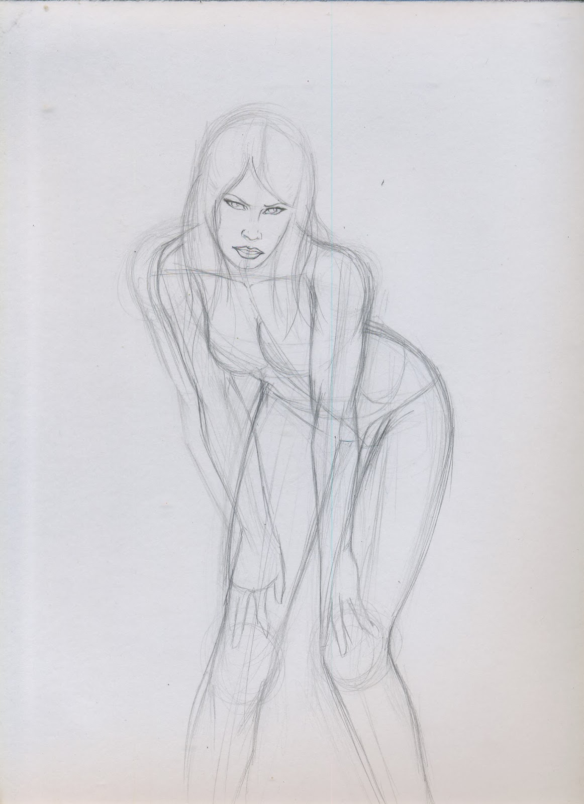
Step One: Guide Lines
Nothing complicated here, just a couple of lines to guide you. Using the pencil, real gently, do the first line using the shape of the models spinal column. This may be hard to see cause of the angle and the pose, but you can still imagine how the bended spine looks from that angle.
Then do a circle for the head. After that a line below the head, around the clavicle area.
A couple of lines for the arms and legs with small circles to indicate where the joints are (shoulders, elbows, knees etc.). After that some curved lines around the guide lines, start giving some shape of the body.
At this moment it doesn't matter if it looks right or not, is just a guide. Go as crazy as you want, just remember to use the pencil gently because you're going to erase this lines at the end.
Step Two: Shaping this mess of lines
Most of the artists that I know, start giving shape to the body by starting with the torso. That’s because the torso is the part that actually "controls" the movement of the body. How you draw the torso can be the difference between drawing a body in action or just drawing something that looks like a stiff doll.
But in my case I start with the head, cause I’m a rebel and I don't follow the rules, and because the head is the part that is closest to the foreground.
After shaping the head, I realized that the head is out of proportion with the rest of the body. It’s a good thing that I did those guide lines gently so I can fix it.
Still using my reference picture I keep giving form to the body. You can see now that the drawing is starting to look more like a female body and less like the mess of lines that I had before.
At this point I’m getting close to how I want the final product to come out so I start pressing the pencil a little harder and erase some of the guide lines.
Step Three: Details - I’ll do what I want
Details, it is up to you how much you want to use, it all depends how you want your drawing to look.
In my case, I use a couple of short lines in the arms to show a little muscle, I want to keep the body type close to the original picture. But If I wanted it to look like a body builder, I would have to make those short lines longer and emphasize the muscle.
If you're not sure how to draw the shape of a muscle or how many muscles are in that part of the body? Thats why you should have a anatomy book. You don't have to draw every single muscle or bone in the body, but, in my opinion, it is good to indicate a couple of them, which ones are up to you.
I see that the gluteus maximus (that would be the muscles in your butt) is on the right side of the figure, so to give some balance to the drawing, I decide to step away from the reference and have the hair blowing in the wind on the left side. Like I said before, the picture is just a reference, you don't have to do a photocopy if you don't want to. You can draw it however you want. So whatever, I’ll do what I want!
Step Four: Finish it
This is the part when you press hard on your pencil to trace the final lines. I prefer to use the mechanical pencil to finish the drawing. I also make some little details like eye lashes, a couple of line on the knees and the sternocleidomastoid (the muscles on the neck).
Erase any dirt and guide lines left and you're done. If it didn't come out like you wanted it, don't worry, the key word is practice. Practice everyday and with time you will see that you will get better. And if you one day you achieve the level of skill you wanted, it doesn’t matter you will keep drawing.
Hope I taught you something today or at least not bored you to death. Any questions or opinions you can email me at geekwhale@gmail.com. I want to give special thanks to the model Loki, photographer Wilfredo Miranda and Cyanide Nation agency for their help in this project. Please go to the links below and give some support to these talented people. Until next time, even if your hand is bleeding DONT STOP, KEEP DRAWING!
https://www.facebook.com/OfficialLokiKypo
https://www.facebook.com/lokiradicalbeautyservice


 I asked a fellow artist friend if he knew of an alternative to a Cintiq tablet, so he sent me an Amazon link of Yiynova MSP19U. Even though it’s way cheaper than a Cintiq, I wasn't sure if I should risk buying it for the price. I was bestowed, later on that same day with a sign by fate, my tax rebate check came in. So I had to choose: spend my new fortune on ridiculous amounts of junk food or get this monitor. The idea of clogging my arteries was tempting, but I decided to buy the MSP19U.
  The Yiynova MSP19U 19” LCD tablet monitor has a resolution of 1440” x 900”, while in the back a stand allows for either complete verticality or nearly horizontal viewing angles, but rotation is not possible. It’s easy to operate and the installation is easy, just insert the CD and follow the instructions (it’s recommended to install the software before connecting the monitor). Plugging the monitor was easy too, technically you just need a USB and VGA port. In my case I have a MacBook and they don't have VGA ports. So if you have a Mac or a laptop without a port, then you should get a VGA adapter, which may cost you around $36.
 The pen is an energy saving stylus that requires AAA batteries (included). It turns off automatically when not in use and activates automatically when you tap the screen. It also has a blue light battery indicator.