Showing posts with label digital art. Show all posts

Thursday, August 7, 2014

Yiynova MSP19U Review


By Silent J   


I asked a fellow artist friend if he knew of an alternative to a Cintiq tablet, so he sent me an Amazon link of Yiynova MSP19U. Even though it’s way cheaper than a Cintiq, I wasn't sure if I should risk buying it for the price. I was bestowed, later on that same day with a sign by fate, my tax rebate check came in. So I had to choose: spend my new fortune on ridiculous amounts of junk food or get this monitor. The idea of clogging my arteries was tempting, but I decided to buy the MSP19U. 


The Yiynova MSP19U 19” LCD tablet monitor has a resolution of 1440” x 900”, while in the back a stand allows for either complete verticality or nearly horizontal viewing angles, but rotation is not possible. It’s easy to operate and the installation is easy, just insert the CD and follow the instructions (it’s recommended to install the software before connecting the monitor). Plugging the monitor was easy too, technically you just need a USB and VGA port. In my case I have a MacBook and they don't have VGA ports. So if you have a Mac or a laptop without a port, then you should get a VGA adapter, which may cost you around $36.


The pen is an energy saving stylus that requires AAA batteries (included). It turns off automatically when not in use and activates automatically when you tap the screen. It also has a blue light battery indicator.

How’s it working out? I used it on Photoshop CS5 and it worked perfectly. The pen is pressure sensitive, so every stroke you make will feel like you’re drawing with a real brush or pen. If it doesn't feel right you can always go to the tablet settings to customize the pen’s pressure. It lags slightly between your pen strokes and the monitor, but that’s something even Cintiq tablets have. 


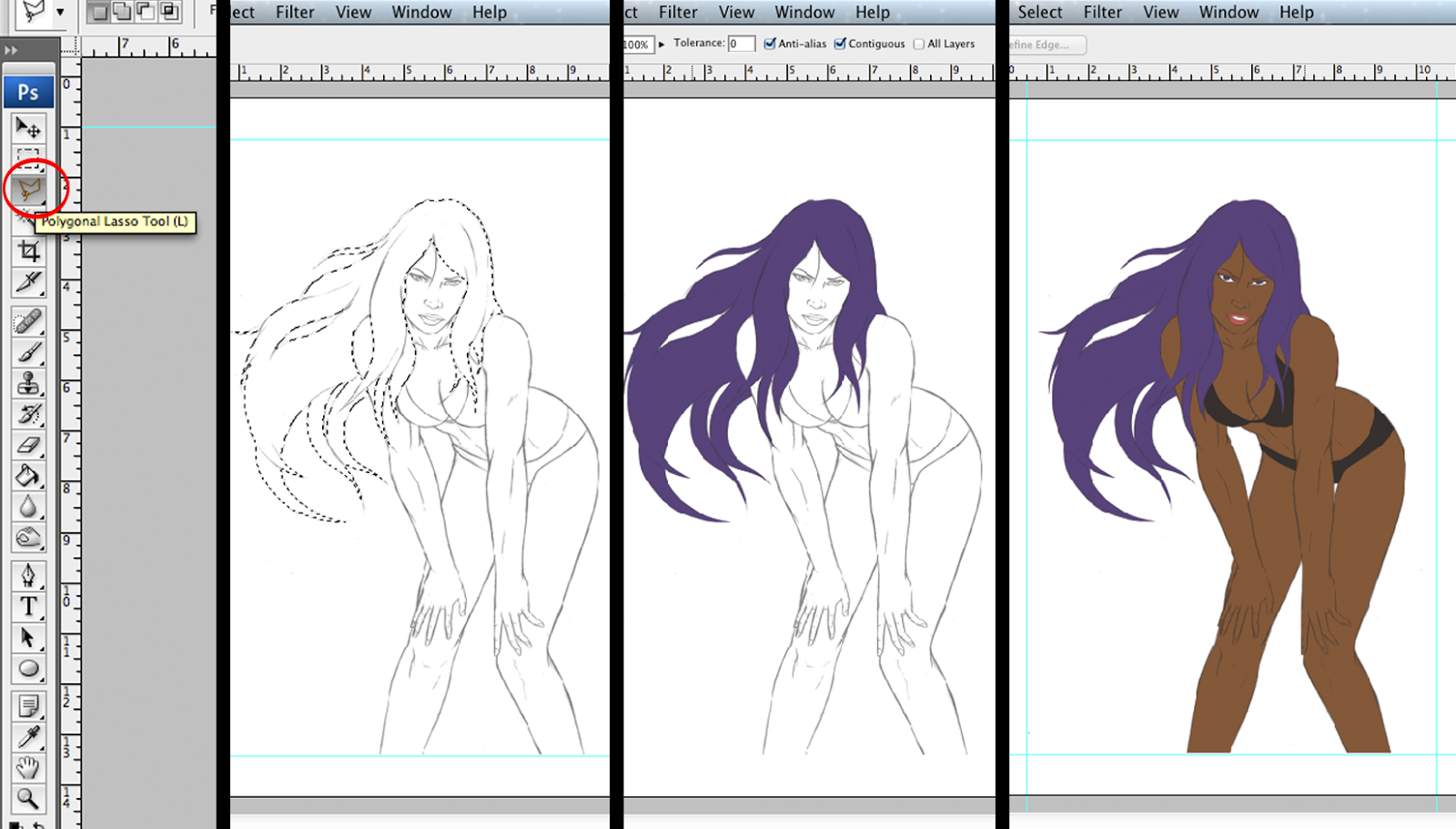
My master piece so far

The best part of this hardware is the price. A Cintiq 22” HD costs $1,999, the Yiynova MSP19U is only $612. With the Yiynova MSP19U you get performance as good as a Cintiq at a 72% less price. I’ve been playing around with its features for a week now and I don’t regret my decision. If you interested in buying a tablet monitor, but your budget is too slim to purchase a Cintiq I highly recommend getting a Yiynova MSP19U. 


Seriously though, this is what I really did


Monday, March 10, 2014

Digital Coloring Part 2

By: Silent J

Greetings grasshoppers, the journey continues. Hopefully you’ve read the first part and have your line art separated from the background. If you don't know what I’m talking about, scroll back to the first part. Now, let’s get to work.

Step four: Making flats

  Below the line art layer, make a new layer and call it "flats". In this layer you will select areas of your art and fill it with a solid color. For me the best way to select the areas is using the polygonal lasso tool. I like using medium-dark colors when filling up areas I like. If done right, your work should look something like this. Don't fill the background on this layer; keep it in another layer below

Step five: Tones

   Duplicate the flats and line art layers. Merge down the line art copy layer to the flats copy layer and name it "tones" (right click or control + click on top of the layer to use merge down option). The reason we're merging these two layers is because we're going to blend everything in this layer. Make sure to turn invisible the original line art layer.

   Now, we’re going to work on the light tones, but for that we first need to establish where the light is going to come from. In my case I decide to make it come from the top right .

 Click on the flats layer and using the magic wand tool select the area you want. I chose the face. Go back to the tones layer and select a light tone of the flat color of the area you chose. Select the brush tool and choose the type of stroke you want. I suggest the airbrush soft.

After that there's an option that says opacity, click it and take it down to 20%. Now the brush strokes that you do on the art won't be solid colors. The more you use the brush in the same area the more color you will put. If you don't understand that last part, just make a new file and go crazy experimenting with the brush and lowering the opacity. You will get it then.


 You're ready. Now, you have to brush the areas where the light reflects. If you put too much light, select the original flat color and use the brush until you’re satisfied with the result. At this point you can also use the blur tool to blend all the tones better.


 It’s important– like I said before– the line art blends with the color, so make sure to paint darker over important line details like eyebrows and eyelashes.

 After the light tones, we’ll begin with the shadows. Select a darker flat tone, but not too black. Just like light tones do the same with the shadows. This time you’ll work on the opposite side and don't forget to use the blur tool.

Just rinse and repeat in all the other areas.

Step Six: Final details

 Almost done! The white areas of the eyes and teeth don't look good if you leave them flat. Give them some shadow using the light tone of the skin. You can make a light reflection effect on the eye by raising the opacity to 100% and by clicking on the pupil with white. 


 Instead of leaving the hair looking like a weird, solid wig we can make the illusion of strands of hairs by using the brush in a smaller size. Make strokes with different hair tones and have some of those come out of the hair root area.


 To make it look a little more interesting use a secondary light source. Where the secondary light comes from is up to you, but to keep it simple make it opposite of the primary light, in my case the bottom left. In the shadow areas use any light color that you want to make the secondary light effect.

  It’s not necessary, but for the heck of it I gave the entire figure an outer glow effect. If you want to do that select all the flats areas and on a new layer fill them whith any color. Go to fx > outer glow and on the window choose the color, the size, and spread you want of the glow. Make sure to keep this layer below the tones layer. 


   We are done! I know it was a long one, but I hope you got some knowledge out of it. Any questions or suggestions you can email me at geekwhale@gmail.com. Until next time! Even if you can't feel your hands don’t stop, keep drawing!

Monday, February 24, 2014

Digital Coloring Part 1


By. Silent J
  Greetings grasshoppers. This tutorial is going to be a little long so I’ll divide it in two parts. This one will show you how to prepare your Photoshop file. It doesn’t sound very exiting, but it’s a very important step before you get to work. I hope you saved the drawing from the last tutorial, because you’ll be using it in these two tutorials. Things that you will need today:

1.      A computer (PC or Mac, your choice)
2.      A scanner
3.      And a Wacom tablet.

  There are different kinds of Wacom tablets you can use, each with different features and prices. If you can spare the change, the Cintiq is available for around $2,499. If your change consists more of pennies, you can get a Bamboo from about $85 to $100. (The link is a bit higher than that price range but it’s not difficult to scour eBay for a good deal.) If you’re out of pennies, then you can use a regular mouse but bear in mind that the same results won’t be the same.

4.      Oh, and Adobe Photoshop.
 
Step one: Scan your work

   
  Make sure to scan your art at a resolution of at least 300 dpi. I can’t really go to detail on how to scan cause all scanners are different, so you’ll have to play with it on your own to find out how it works.

Step two: Make a new file

  For those not too familiar with Photoshop, go to File>New. Next, put the size that you want. I personally use 11”x17”, the standard size for comic books. The resolution, as always, should be 300 dpi. If you're going to print it, the color mode should be CMYK, but, if you just want to keep it digital or to upload on a website like deviantArt, go for RGB.

 
  After that, place your art on the file by clicking File>Place and choose your art.


Once you’re done with that, place the art however you want. The art might not look dark enough, so to fix that, go to Image>Adjustments>Brightness/Contrast. There, play with the sliding bars until you make it as dark as you want.. If you need to clean up the art, use the brush tool with white.


Step Three: Separate line art from background

  It’s easier said than done. But first, merge down the line art layer with the background layer just to make sure that the art is the same size as the file. To merge the layers, right click (Control+click on PC, Command+click on Mac) on the art layer, and click the merge down option.


 Next, double click the background layer, and when the window appears press Okay to unlock it. The padlock icon on the layer disappears and the layer changes to "Layer 0".


  Next, go to Select>All, then Edit>Cut. Then go to the Channel window and make a new layer (the layer should look black). In this channel layer, click Edit>Paste to put the art.


  Here comes the tricky part though, because we want to select only the line art but it won't work by clicking Select. What you’ll have to do is put the cursor on top of the channel thumbnail (small square on the layer that looks like the art), then push and hold control (command on Mac). The cursor should change to a hand with a square on top . 


 Without letting go of control or command click the channel thumbnail. If done right you selected all the space around the line art. 


  With this selection, we then go back to the layer window and make a new layer. Go to Select>Inverse, then using the color black, go to Edit>Fill. When the window pops out click Okay, and you should have your line art background free. Make sure to fill layer 0 with white.


  Finally, be sure to save this file because in part 2 we get started with the fun part.